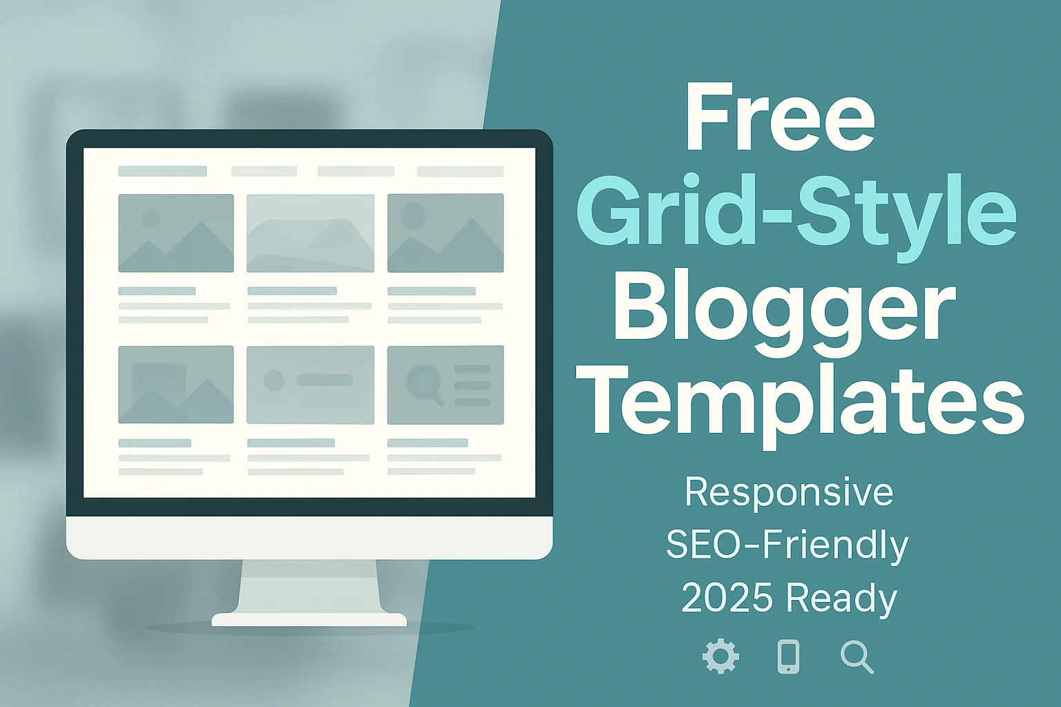
When building a blog on Blogger (Blogspot), choosing the right template isn’t just about aesthetics it’s about functionality, responsiveness, SEO performance, and customization freedom.
That’s why grid-style Blogger templates are a top choice 2026 for bloggers looking for a clean, structured, and highly visual layout.
Whether you’re starting a photography blog, fashion site, or news portal, these free Blogger templates grid style layouts are designed to help you stand out with no attribution requirements and full mobile responsiveness.
In this guide, we’ll explore the best free Blogger templates in grid style format that are SEO-friendly, responsive across devices, and tailored for user engagement.
Table Of Contents
What Are Grid-Style Blogger Templates and Why Use Them?
A grid-style Blogger template is a modern blog layout that organizes your posts into evenly spaced cards or tiles, typically arranged in rows and columns.
Unlike the conventional single-column blog format, a grid layout allows multiple articles to be visible on the screen simultaneously.
This Structure enhances user experience by enabling visitors to scan, click, and navigate content faster.
These templates focus on clean content organization and visual appeal, making them ideal for bloggers who rely heavily on images or frequently publish content across categories.
How Grid Layouts Differ from Traditional Blogger Templates?
Traditional Blogger templates usually present content in a single vertical stream, with one post following the next.
While this format is readable, it’s not always the most efficient for content-rich or image-heavy blogs.
Grid layouts, on the other hand, leverage responsive web design principles to arrange content in blocks that automatically adjust to different screen sizes.
The layout remains functional and visually balanced whether a reader is on a desktop or mobile device.
This responsiveness ensures your blog stays accessible and engaging across devices.
Why Grid Templates Are an Excellent Choice?
Choosing a grid-style layout isn’t just about looks.
It directly impacts how readers interact with your content:
- Efficient browsing: Readers can view multiple posts simultaneously, encouraging more clicks and longer sessions.
- Stronger visuals: Image previews, featured thumbnails, and creative content arrangements draw attention.
- Responsive performance: Built-in responsiveness makes these templates mobile-friendly and fast-loading, which is key for SEO and user retention.
- Modern and minimalistic: Aesthetically clean grid layouts are popular among bloggers who want a professional and contemporary feel.
Who Should Use Grid-Style Blogger Templates?
Grid templates are well-suited for blogs emphasizing design, imagery, or frequent content updates.
If your blog falls into any of the following categories, this layout can enhance both usability and presentation:
- Photography blogs that showcase image portfolios
- Lifestyle and fashion blogs focused on visuals and product features.
- News or magazine-style blogs that require categorization of frequent posts
- Design or personal portfolio sites aiming for an elegant presentation
These templates are often customizable and can be adapted for personal blogs or niche sites that want a grid-style appearance without copyright restrictions.
Use-Cases – Who Should Use Grid Blogger Templates?

Choosing the right Blogger template depends on more than just aesthetic preference.
A grid-style layout serves specific content types and niches better than others, particularly when visual presentation, content volume, or frequent updates are core to your blog’s purpose.
These free Blogger templates grid style designs are visually modern and structured to enhance usability, engagement, and content visibility.
The grid layout isn’t a one-size-fits-all format—it fits best in blogs where content can be displayed in blocks or thumbnail previews and where users benefit from seeing multiple posts at once.
Let’s look at the blog types and industries that benefit the most from free responsive grid-style Blogger templates:
1. Fashion Bloggers
For fashion-focused blogs, where visual storytelling and product highlights are essential, a grid layout allows multiple outfit photos, lookbooks, or seasonal collections to be presented simultaneously.
These templates also support thumbnail previews, clean spacing, and social media integrations important elements for fashion creators building a personal brand.
2. Photography Portfolios
If your blog is a portfolio of your visual work, a grid template provides the Structure to showcase images with clarity and balance.
Responsive web design keeps your photos sharp and organized on all screen sizes.
These templates often come with built-in gallery features or Pinterest-style image loading, ideal for photographers.
3. Image-Heavy Personal or Lifestyle Blogs
For lifestyle or personal bloggers who frequently publish content that includes visuals travel experiences, food photography, decor tips, or tutorials a grid-style Blogger template helps organize those posts in digestible tiles.
Users are less likely to scroll endlessly and more likely to find something they want to read.
4. Magazine & News-Based Blogs
News platforms and multi-author blogs thrive on high content volume.
A traditional single-column format becomes cluttered with multiple updates per week (or per day).
Grid-style templates categorize and display stories in trending, latest, or feature sections. This keeps the blog readable, structured, and SEO-optimized.
5. Pinterest-Style and Minimalist Layouts
Some grid templates are designed with a Pinterest-style card layout, offering a dynamic, multi-post visual feed that’s easy to browse.
These are especially helpful for curation blogs, craft or recipe collections, or visually dominant content.
Others opt for a minimalist approach, perfect for bloggers seeking simplicity without sacrificing modern design.
Key Features to Look for in a Grid-Style Blogger Template

Choosing the right grid-style Blogger template is more than just a visual decision.
While the layout certainly plays a role in user experience, the underlying features determine how well your blog performs across devices, in search engines, and in your niche.
Before downloading any free Blogger template grid style, evaluating the template’s structural, functional, and SEO capabilities is important to ensure long-term usability.
Below are the essential features for selecting a grid-style layout template for your Blogger site.
1. Copyright-Free or Editable Footer (Template Attribution)
Many free templates come with designer credits embedded in the footer.
While this is common practice, some restrict you from removing or editing this credit, which can affect your blog’s branding.
A quality free Blogger template without copyright offers either:
- No footer credit at all
- Editable footer section via the Blogger layout builder
This gives you full control over your blog’s professional appearance and ensures compliance if you plan to monetize or white-label your site.
2. Fully Responsive and Mobile-Friendly Design
With mobile traffic dominating most niches, your grid template should be built using responsive web design principles.
This ensures your layout adjusts fluidly across mobile devices, tablets, and desktops without compromising user experience.
A responsive grid layout often includes:
- Auto-adjusting columns and post previews
- Touch-optimized image sliders or galleries
- Mobile-friendly menus and widgets
3. SEO-Optimized Structure
Your template’s code structure significantly impacts how well your content ranks in search engines.
Look for templates designed as SEO friendly Blogger themes, which often include:
- Proper heading hierarchy (H1, H2, H3)
- Fast-rendering HTML and lightweight CSS
- Schema markup for better snippet visibility
- Internal linking-ready layouts
This Structure helps improve the crawlability and indexing of your posts.
4. Fast Loading Speed
A grid layout uses many visual elements, so speed optimization is key.
A well-coded template should:
- Defer or minify unnecessary JavaScript
- Load thumbnails using lazy load techniques
- Compress images or support WebP formats.
Templates with fast loading speeds improve user engagement and Core Web Vitals, which Google considers for search rankings.
5. Drag-and-Drop Layout Builder or Manual XML Customization
Templates built with the Blogger layout builder allow you to easily rearrange page sections, widgets, and modules without touching the code.
A template allowing manual XML customization provides full flexibility for advanced users.
Both options should support:
- Reordering sidebar or footer widgets
- Adding/removing featured sections
- Adjusting grid columns or featured post displays
6. Integrated Social Media Support
Modern blogging requires more than just great content.
Your template should come with the following:
- Social share buttons for posts
- Sticky or header social icons
- Optional Instagram or Pinterest widgets
This allows for easier engagement, higher shares, and extended audience reach—all without needing third-party plugins.
Top 12+ Free Blogger Templates Grid Style in 2026
Finding the right grid-style Blogger template isn’t just about visual design it’s about choosing one that aligns with your content goals, niche, and technical requirements.
The following curated list features free Blogger templates grid style, hand-picked for 2026 based on layout design, responsiveness, SEO optimization, and copyright flexibility.
Each template listed below is compatible with modern devices, customizable via Blogger’s built-in tools, and ideal for various blogging purposes like fashion, photography, lifestyle, or news sites.
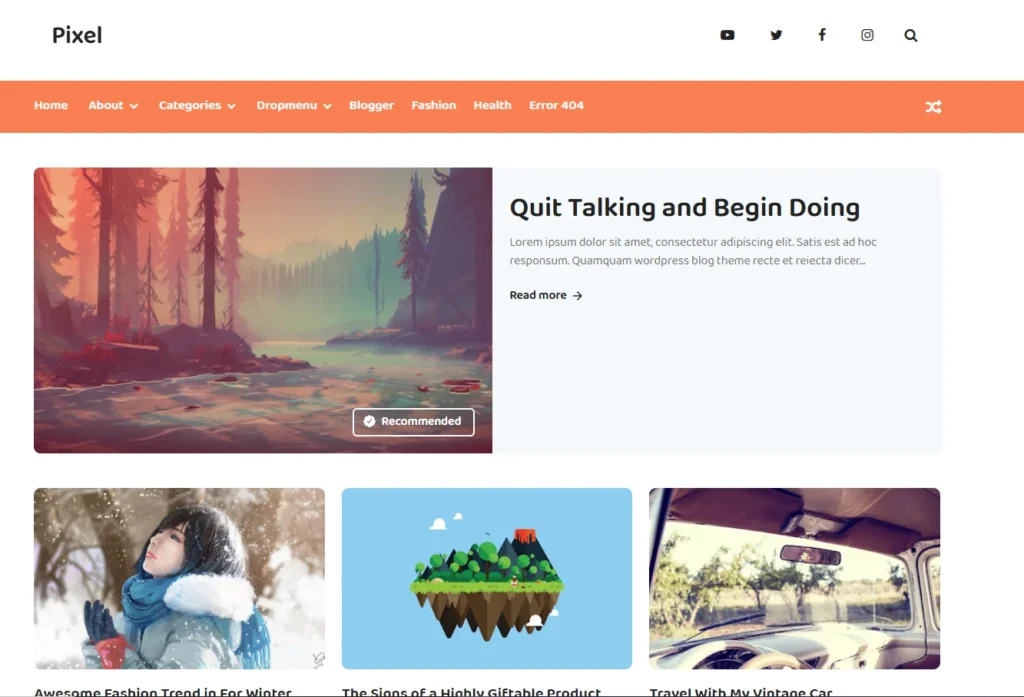
1. Pixel Grid Blogger Template
Layout Type: 2-column grid with featured post support
Responsive: Yes
SEO-Friendly: Built with clean code and optimized for readability
Attribution: Footer credit can be removed
Best For: Tech blogs, product reviews, minimalist writers
The Pixel template offers a simple, distraction-free layout with strong visual alignment.
It uses thumbnail previews for posts and supports widgets like recent posts, labels, and social media icons.
It perfectly blends function and minimalism for bloggers who want clarity and fast performance.
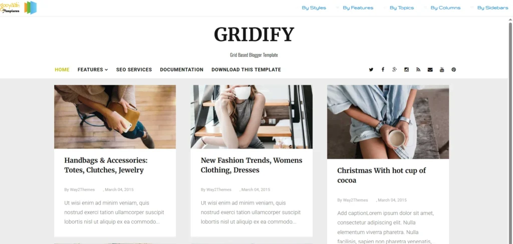
2. Gridify Blogger Template
Layout Type: 3-column responsive grid layout
Responsive: Fully mobile-optimized
SEO-Friendly: Optimized HTML structure with clean sidebar navigation
Attribution: Footer credit is removable with ease
Best For: Lifestyle bloggers, fashion bloggers, curated content sites
Gridify combines modern typography with a Pinterest-style layout that displays multiple posts simultaneously.
Its minimalist design focuses on content presentation while maintaining high mobile usability.
The flexible widget areas allow you to display categories, featured content and calls to action.
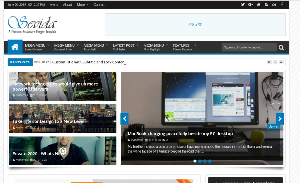
3. Sevina Blogger Template
Layout Type: 2-column image-focused grid layout
Responsive: Yes, fluid layout with smooth transitions
SEO-Friendly: Includes clean metadata structure and optimized headings
Attribution: Footer credit removable
Best For: Fashion, beauty, and lifestyle bloggers seeking a premium look for free
Sevina stands out for its polished, editorial-style appearance.
The design prioritizes full-width featured images and posts thumbnails arranged in a clean grid layout, ideal for high-quality fashion content.
With support for social media icons, dropdown navigation, and customizable color schemes, it aligns perfectly with the needs of modern lifestyle influencers.
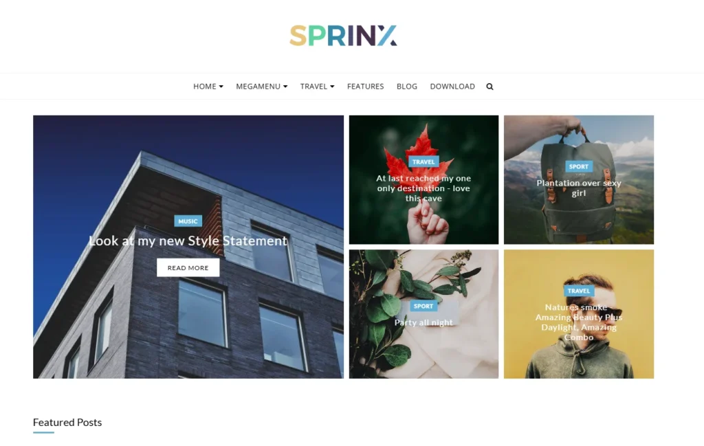
4. Sprinx Blogger Template
Layout Type: Multi-column grid with optional sidebar
Responsive: Fully mobile-optimized and tablet-friendly
SEO-Friendly: Structured data support, optimized for Core Web Vitals
Attribution: Credit-free option available
Best For: Bloggers focused on speed, SEO rankings, and content-heavy sites
Spring is crafted for performance.
Built with lightweight code and minimal scripts, it loads quickly while maintaining a structured and user-friendly design.
The layout balances visual elements and readability, making it ideal for bloggers who care about aesthetics and technical SEO.
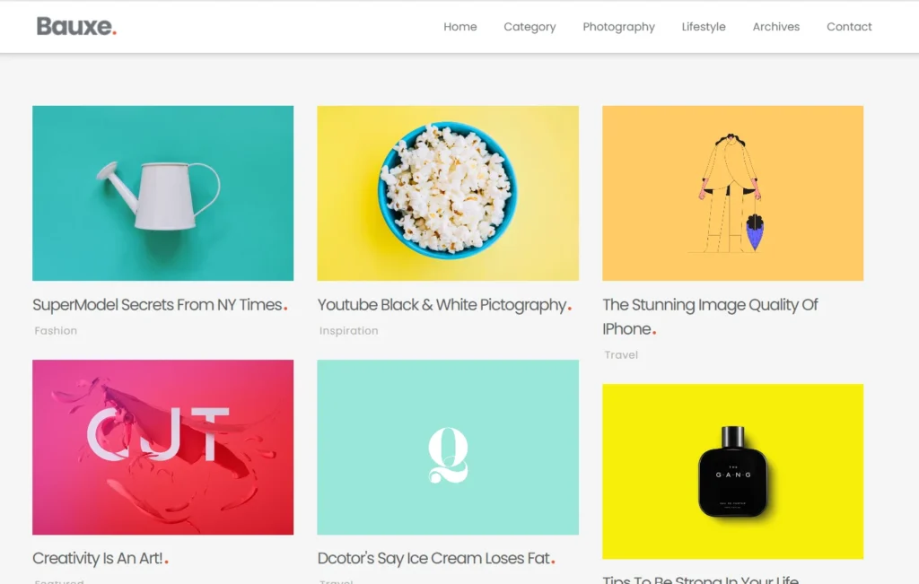
5. Bauxe Blogger Template
Layout Type: Full-width grid with large thumbnails and gallery options
Responsive: Yes, highly adaptable to image display on all devices
SEO-Friendly: Includes alt-tag-ready image blocks and structured layout
Attribution: Comes with an editable footer
Best For: Photography blogs, travel content creators, and designers with a visual portfolio
Bauxite is built to enhance visual storytelling. It uses a bold grid that highlights images prominently, making it a smart choice for photographers, visual artists, or travel bloggers.
With native support for high-resolution images and Pinterest-style arrangement, it bridges aesthetic depth with performance.
6. GridMag Blogger Template
Layout Type: Multi-column magazine-style grid
Responsive: Yes, fluid and mobile-optimized
SEO-Friendly: Clean HTML structure, optimized headings, and schema-ready
Attribution: Offers editable footer section
Best For: News blogs, tech updates, digital magazines, and multi-category sites
GridMag is structured for high-volume publishers who want to display articles from various categories in a clean, professional layout.
With its magazine-style blog layout, GridMag separates featured stories, trending topics, and recent posts across a flexible grid.
It supports content segmentation and label filtering and offers excellent readability across devices.
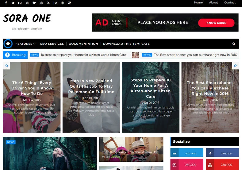
7. Sora One Blogger Template
Layout Type: Two-column grid with social-ready header
Responsive: Yes, optimized for mobile, tablet, and desktop
SEO-Friendly: Lightweight, minimal script, and mobile-first indexing compliant
Attribution: The footer can be customized or removed
Best For: Personal blogs, lifestyle content creators, or affiliate bloggers
Sora One is a versatile grid-style theme designed for bloggers who want to boost social engagement.
It includes built-in social media buttons in the header, sidebar, and post footers.
Combined with its grid structure and well-aligned typography, it helps maintain a content-focused yet shareable blog layout that performs well across devices.
8. PhotoMag Blogger Template
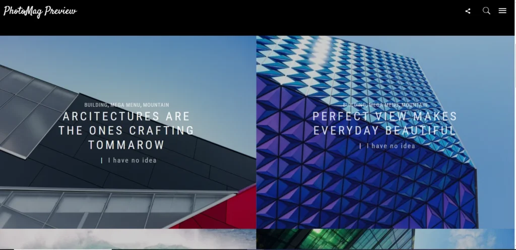
Layout Type: Masonry-style Pinterest grid
Responsive: Fully adaptable to image resizing and screen scaling
SEO-Friendly: Alt-tag optimized, image-first indexing friendly
Attribution: Credit can be removed
Best For: Photography blogs, visual storytelling, personal portfolios
PhotoMag is ideal for image-heavy blogs and visual creators who want to present their content in a Pinterest-style blog template.
The masonry grid layout arranges content blocks in staggered rows, creating a dynamic and engaging presentation.
With a focus on image quality, loading speed, and minimal distractions, PhotoMag is tailored for photographers, travel bloggers, and designers.
9. WriteUp Blogger Template
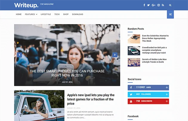
Layout Type: 2-column minimalist grid layout
Responsive: Fully responsive across all screen sizes
SEO-Friendly: Clean coding structure, optimized headings, schema-ready
Attribution: The footer is customizable and can be removed
Best For: Personal blogs, writing portfolios, journaling, essay-style blogs
WriteUp is a clean and clutter-free grid-style Blogger template tailored for content-first bloggers.
It focuses on typography and readability, making it an excellent fit for authors, storytellers, and niche writers.
With its minimal layout and quick-loading performance, WriteUp delivers a distraction-free reading experience while supporting images and embedded media.
10. Glamour Blogger Template
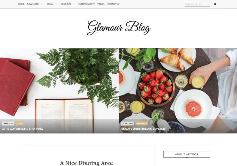
Layout Type: 3-column responsive grid
Responsive: Yes, with elegant mobile transition effects
SEO-Friendly: Lightweight Theme with proper metadata and post structure
Attribution: Allows removal or customization of footer credit
Best For: Beauty bloggers, feminine lifestyle creators, mom bloggers
Glamour blends visual charm with functional design, making it a standout among free feminine grid-style Blogger templates.
The layout includes rounded thumbnails, pastel-accented color palettes, and optional featured post sections.
Glamour is brandable and adaptable, allowing users to emphasize aesthetics without sacrificing SEO or loading speed.
11. Boxy Blogger Template
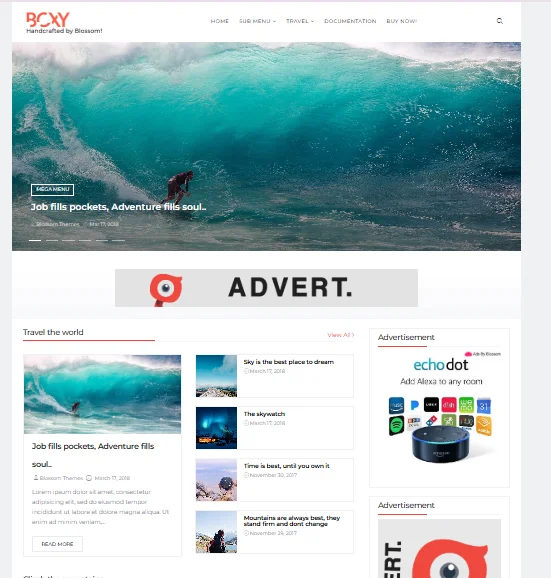
Layout Type: Grid layout with featured post header and sidebar
Responsive: Yes, optimized for devices and browser compatibility
SEO-Friendly: Structured with clean HTML, ready for affiliate integration
Attribution: The footer can be edited or removed based on the need
Best For: Tech blogs, gadget reviews, software or product reviewers
Boxy is designed for content-heavy blogs that thrive on consistent publishing.
It’s ideal for tech and review bloggers, offering well-defined spaces for thumbnails, metadata, and CTAs.
Its smart sidebar layout allows bloggers to highlight product categories, deals, or review ratings, making it a practical theme for those who monetize through affiliate content.
12. Alpha Blogger Template
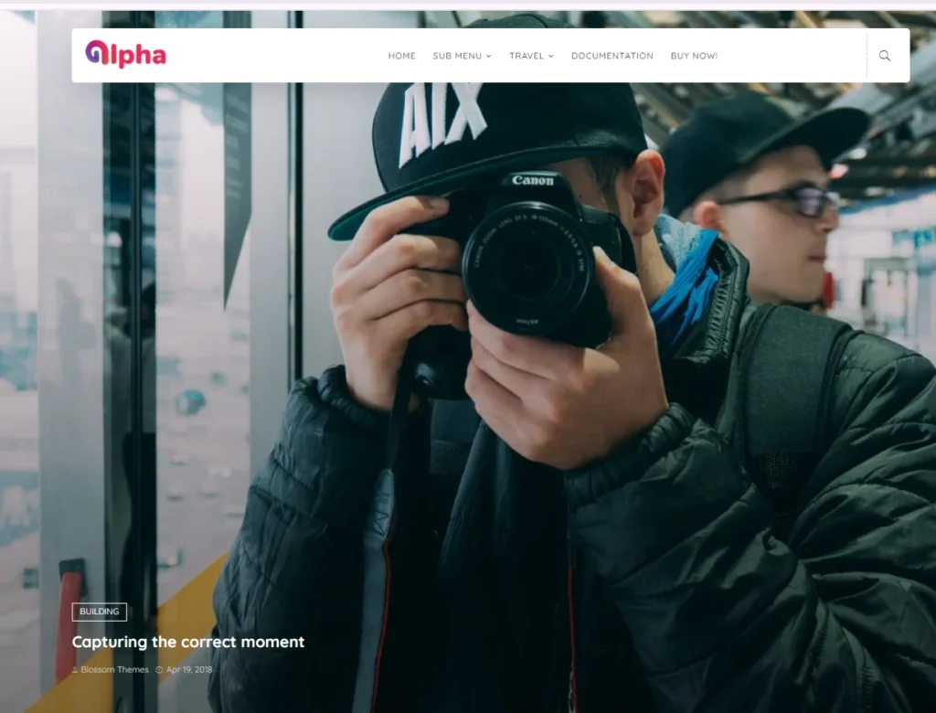
Layout Type: Ultra-light 2-column responsive grid
Responsive: Fully mobile-optimized with minimal visual clutter
SEO-Friendly: Optimized for fast loading, minimal script usage
Attribution: No mandatory footer credit
Best For: Beginners, text-focused bloggers, low-maintenance blogs
Alpha offers a no-frills blogging experience with its lightweight codebase and user-friendly design.
It’s perfect for those starting with a free Blogger template grid style who prefer speed and simplicity over feature-packed complexity.
Alpha supports core customization options through the Blogger theme editor despite its minimalist nature.
Comparison Table – Grid Templates at a Glance
Choosing the right free Blogger template in grid style often comes down to comparing key features that matter most: layout type, mobile responsiveness, SEO readiness, and customization flexibility.
To simplify your decision, the table below provides a side-by-side view of the top-performing grid-style Blogger templates, helping you select one based on your niche, technical needs, and design preferences.
This overview is especially helpful if you’re unsure which layout suits your blog type or want a quick reference before trying them out.
| Template | Layout Type | Responsive | SEO Friendly | Footer Credit | Best For |
|---|---|---|---|---|---|
| Pixel | Grid, 3-column | ✅ | ✅ | No | Tech, Fashion |
| PhotoMag | Masonry Grid | ✅ | ✅ | Editable | Photography, Visual Blogs |
| Sevina | 2-column, Elegant | ✅ | ✅ | Removable | Fashion, Beauty, Lifestyle |
| Sprinx | Multi-column Grid | ✅ | ✅ | Optional | SEO-focused, Fast Blogs |
| Bauxe | Full-width Gallery | ✅ | ✅ | Editable | Image-heavy, Travel |
| GridMag | Magazine Layout | ✅ | ✅ | Editable | News, Tech, Editorial |
| Sora One | 2-column with social | ✅ | ✅ | Customizable | Lifestyle, Personal |
| WriteUp | 2-column Minimal | ✅ | ✅ | Customizable | Writers, Journalists |
| Glamour | Feminine 3-column | ✅ | ✅ | Removable | Beauty, Fashion Blogs |
| Boxy | Featured + Grid | ✅ | ✅ | Customizable | Tech Reviews, Product Blogs |
| Alpha | Lightweight 2-column | ✅ | ✅ | None | Beginners, Minimalist |
This comparative Structure lets you identify which template best fits your blogging goals, whether publishing product reviews, showcasing photography, or creating long-form content.
Templates Categorized by Niche & Design Purpose

Every blogger has a unique voice and audience, and the design of your blog should reflect that.
Whether running a visual-centric photography blog or a text-driven personal journal, the right grid-style Blogger template can elevate user experience and support your content goals.
This section breaks down some of the best free Blogger templates in a grid style, organized by niche and blog type, to help you find the perfect fit.
These recommendations align with design, responsiveness, SEO performance, and ease of customization.
1. Grid Templates for Fashion & Lifestyle Blogs
Fashion bloggers and lifestyle content creators rely heavily on visuals, aesthetics, and structured layouts to showcase outfits, routines, or brand collaborations.
Templates like Sevina and Glamour use elegant blog layouts, pastel accents, and polished fonts to highlight visuals without clutter.
Their responsive designs ensure every image and post loads seamlessly across devices.
Look for features like:
- Full-width featured images
- Custom widgets for Instagram or Lookbooks
- Removable footer credits
- Integrated social media buttons
2. Best Grid Themes for Photography Portfolios
Photographers need a layout that places their work front and center.
Templates like Bauxe and PhotoMag are ideal for image-heavy blogs, offering dynamic gallery grids and support for high-resolution thumbnails.
These templates often adopt a Pinterest-style layout, enabling visual browsing and strong first impressions.
Choose templates that offer:
- Masonry-style or multi-column grids
- Lazy load or compressed image support
- Caption-ready image displays
- Custom label filtering for photo categories
3. Minimal Grid Blogger Templates for Writers & Personal Blogs
For bloggers focused on storytelling, personal insights, or writing-focused content, clutter-free templates like WriteUp and Alpha balance Structure and simplicity.
These templates emphasize readability, whitespace, and typography while retaining a grid-style layout’s functional benefit.
Ideal for:
- Essay-style blogs
- Journaling
- Writing portfolios
- Niche content creators
4. Grid Layouts for Tech, News & Review Sites
A magazine-style blog layout is key for blogs that publish frequent content like tech reviews, news updates, or product roundups.
Templates such as Boxy and GridMag are designed for this exact purpose, offering flexible sidebars, featured post sliders, and structured categorization.
Look for layouts with:
- Post thumbnail alignment
- Integrated CTA widgets
- Sidebar for product categories or tags
- SEO-optimized meta structures
How to Install and Customize a Blogger Grid Template?

Once you’ve chosen the right free Blogger template in grid style, the next step is implementation whether using a minimalist layout for a personal blog or a magazine-style grid for content-heavy publishing, installation, and customization can be straightforward if approached methodically.
This step-by-step guide will walk you through installing your downloaded template using the Blogger dashboard, making visual changes using the layout designer, and optimizing your design for better performance and branding.
1. Uploading the XML Template to Blogger
After downloading your preferred template (usually in .xml format), upload it through the Blogger platform.
- Open your Blogger dashboard.
- Navigate to Theme in the left-hand panel.
- Click the arrow beside Customize, then select Restore.
- Choose Upload and select your XML template file.
- Save changes and preview your blog to confirm the installation.
This process replaces your current Theme, so always back up your existing template before uploading a new one.
2. Customizing the Template with the Theme Editor and Layout Panel
Once your grid-style template is uploaded, you can fine-tune the design through Blogger’s built-in customization tools.
- Theme Editor allows font style changes, background color, and default widths.
- Layout Panel lets you move widgets, update header and footer components, and arrange elements like social icons, navigation, or post sliders.
For grid-specific templates, ensure the layout maintains visual consistency by keeping column widths balanced and sidebar elements concise.
3. Widget Customization Best Practices
Custom widgets add functionality but should be used sparingly to maintain loading speed and mobile performance. Here are a few tips:
- Place Labels, Recent Posts, and Popular Posts widgets in the sidebar for better navigation
- Use only one social sharing plugin to avoid conflicts
- Avoid unnecessary JavaScript widgets that can slow down your responsive grid-style Blogger template
4. Remove Footer Credits (If Allowed)
Some free Blogger templates have grid styles with credit links in the footer. If your selected template allows removal, here’s how to do it:
- Go to Theme> Edit HTML
- Use CTRL+F to search for terms like “Designed by” or “footer.”
- Carefully delete the credit line (only if permitted by the template license)
- Save changes and preview the blog.
It’s essential to check the documentation or license of the template provider to avoid violating usage terms. Templates labeled as “Free Blogger templates without copyright” usually permit this.
Pros and Cons of Using Free Grid-Style Blogger Templates
Free grid-style Blogger templates have become a go-to for bloggers who want modern design without paying a premium.
But while they offer visual appeal and flexible layouts, they also come with limitations worth considering before installation.
Here’s a quick comparison to help you weigh the advantages and drawbacks of using these templates on your blog:
| Feature | Pros | Cons |
|---|---|---|
| Visual Design | Sleek, modern layout that enhances user experience with organized content blocks | May rely heavily on images, which can slow down poorly optimized blogs |
| Cost | Completely free to use—ideal for beginner bloggers and side hustlers | Some templates include hidden limitations like required footer attribution |
| SEO Readiness | Many templates are built as SEO-friendly Blogger themes with clean code and structure | Not all are optimized for schema, heading hierarchy, or speed |
| Mobile Responsiveness | Built with responsive web design for mobile, tablet, and desktop compatibility | Older templates may lack full mobile adaptability |
| Customization | Compatible with Blogger’s drag-and-drop layout editor and template customization tools | Limited compared to premium themes or custom-coded solutions |
| Support & Updates | Quick to install and modify via Blogger dashboard | Rarely updated, and no customer support from most developers |
| Attribution & Branding | Some offer templates without footer credit for full branding control | Many free Blogger templates require credit links in the footer (unless licensed) |
Whether you’re looking for a visual-first layout for your photography blog or a minimalist design for personal journaling, free grid-style templates can deliver—if chosen wisely.
If attribution-free usage, clean SEO structure, and customization flexibility are your priorities, consider templates like:
Common Mistakes to Avoid When Choosing Free Templates
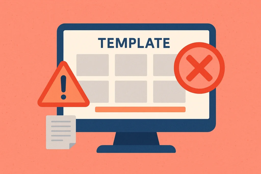
While countless free Blogger template grid styles are available, not all of them will meet your blog’s performance, SEO, or design needs.
Selecting the wrong template can lead to poor user experience, slow loading times, or technical issues.
Here are some of the most frequent mistakes bloggers make when choosing free templates and how to avoid them to ensure your blog is functional and future-ready.
1. Choosing Outdated or Non-Responsive Templates
Templates that haven’t been updated for years often lack modern design standards, security compliance, and mobile optimization.
Using a non-responsive layout results in poor display on smartphones and tablets, negatively affecting user experience and SEO rankings.
Always check whether the template uses responsive web design and fits the current Blogger dashboard features.
2. Ignoring SEO-Friendliness and Clean Code
An appealing grid layout isn’t enough if the template isn’t SEO-friendly.
Poor HTML structure, missing meta elements, and heavy scripts can impact your site’s indexing and loading speed.
Choose templates optimized for search engines, preferably those designed as SEO-friendly Blogger themes with schema support and semantic markup.
3. Not Checking for Attribution or Footer Credit Requirements
Many free Blogger templates come with designer credit links in the footer, and not all allow removal.
Using a template that mandates attribution can interfere with your brand identity, especially if you aim for a professional appearance.
Ensure the template falls under the category of free Blogger templates without copyright or offers a clear option to edit or remove footer links.
4. Failing to Test Templates on Real Devices
A template might look perfect in the preview, but real-world performance can differ across devices and browsers.
Testing how the grid layout behaves on mobile phones, tablets, and different screen resolutions is essential.
Templates using drag-and-drop blog layout editors or those optimized for flexible grids are more likely to maintain consistency across platforms.
Tips to Speed Up Grid Blogger Templates

While grid-style Blogger templates are visually engaging and modern, their Structure often includes featured images, dynamic widgets, and layered layouts — all of which can impact loading speed if not properly optimized.
As Core Web Vitals and page performance influence search rankings, optimizing your free Blogger template grid style is essential for user retention and SEO success.
Here are practical, platform-specific strategies to boost your Blogger site’s performance while maintaining your preferred grid layout.
1. Optimize Image Sizes and Use WebP Format
High-resolution images are key to a visually striking grid layout but can significantly slow down page loading if not optimized.
Use lightweight, compressed formats such as WebP, which offer high quality at smaller file sizes.
Ensure thumbnails are scaled appropriately, and avoid uploading full-size images unless necessary.
You can compress and convert images using free tools before uploading or enable third-party image CDN plugins (like Cloudinary) for automatic optimization.
2. Minimize Widget Usage Across Layouts
Widgets like comment counters, tag clouds, and recent post sliders may look appealing but often inject unnecessary JavaScript into your template.
Limit your use of widgets, especially those placed in the sidebar or footer.
Keep only essential tools like social share buttons or navigation elements that serve your readers.
Templates with drag-and-drop blog layout support allow you to easily rearrange and disable widgets from the Blogger layout designer, which helps streamline your design.
3. Use External Hosting for Large Files
Avoid directly hosting large assets like downloadable PDFs, background videos, or uncompressed media on Blogger.
Instead, upload these to Google Drive, Dropbox, or your preferred cloud hosting platform and embed or link them externally. This reduces bandwidth consumption and prevents unnecessary delays during page load.
This is especially useful when using grid templates for image-heavy blogs or portfolio-style pages.
4. Compress HTML, CSS, and JavaScript
Clean and compressed code is critical for performance, especially when using grid layouts that depend on multiple style and script layers.
You can manually minify your template’s HTML, CSS, and JS or use online tools like Minifier.org or HTMLMinifier.
If your template was downloaded from a third-party provider, check if a compressed version is available.
Also, reduce inline CSS and avoid excessive use of custom fonts or animations that aren’t cached efficiently.
Final Thoughts
Selecting a grid-style Blogger template isn’t just about aesthetics—it’s a decision that affects SEO, user experience, and long-term growth.
Whether you want a clean writing layout, a stylish photo gallery, or a responsive theme for tech reviews, your template should match your niche, performance needs, and customization preferences.
If you’re unsure where to start, consider the top-performing templates from this list:
Each of these supports template customization, mobile responsiveness, and monetization compatibility—making them ideal for serious bloggers.
Explore your options, test templates on mobile devices, and personalize your blog using Blogger’s built-in tools.
If you’re ready to grow your blog, don’t overlook performance and usability—they matter more than you think.
If you found this guide helpful or need advice on selecting a theme, please drop your question in the comments.
FAQs – Free blogger templates grid style
What is the best free Blogger template?
The “best” template depends on your niche and goals. For a minimalist writing blog, WriteUp is a great option.
For image-centric blogs, PhotoMag or Bauxe provides a strong visual presentation.
If you’re looking for SEO performance, Spring stands out as an SEO-friendly Blogger theme.
Which Theme is best for bloggers?
Bloggers seeking flexibility and performance often choose grid-style templates that are responsive, SEO-optimized, and compatible with the Blogger dashboard.
Templates like Pixel, GridMag, or Alpha offer strong layouts and easy navigation, suitable for beginners and seasoned bloggers.
How do you choose a Blogger template?
Start by evaluating your niche (fashion, tech, photography, etc.), layout preferences (2-column, magazine-style), and required features like mobile responsiveness or widget compatibility.
Always prioritize templates with fast loading speed, customizable sections, and clean SEO structure.
Can I earn money from Blogger for free?
Yes. You can monetize Blogger blogs using AdSense, affiliate marketing, or sponsored posts.
Many free Blogger template grid styles include ad-ready spots and CTA-friendly layouts to support monetization strategies.
How can I customize these grid templates for my niche blog?
Customizations can be done via the Theme Editor and Layout Designer in the Blogger dashboard.
You can change fonts, colors, logos, sidebar widgets, and more without coding.
Templates that support template customization make adapting the design to your brand easier.
What are the fastest-loading free grid Blogger themes available now?
Templates like Sprinx, Alpha, and Boxy are designed for speed.
They use compressed code, minimal external scripts, and lean styling to offer better Core Web Vitals performance across devices.
Are there any responsive grid templates that support e-commerce features?
Yes. Some grid-style templates offer product card layouts, featured product sections, and even checkout integration (via third-party platforms).
StoreMag and BetaCommerce are popular among bloggers who are creating small online stores within Blogger.
Which grid-style template offers the best SEO optimization for bloggers?
Templates like Sprinx, Pixel, and GridMag are known for their clean heading structure, fast page speed, and mobile-first design—all traits of an SEO-friendly Blogger theme.
They’re suitable for content creators aiming for organic growth.
Can I add social media buttons easily to these Blogger grid themes?
Most modern free responsive grid-style Blogger templates support built-in social media buttons or widget areas where you can place third-party scripts.
Templates like Sora One and Glamour are designed with social sharing in mind.
Also Read:
- Top Best SEO Audit Tools 2026 [In-Depth Review]
- How to Start a Lifestyle Blog and Make Money in 2026
- 17 Best Sites Like Pinterest (2026 Guide for Creatives, Designers & Visual Explorers)